Friday, February 20, 2015

What Are Sets in Tableau and When Should You Use Them?

This article is to provide a quick overview of what sets are and when they are most commonly used. 

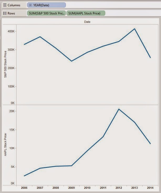
Firstly, a set is a custom field that you create in Tableau Desktop that represents a group of members in a dimension matching a specific criteria. For example, if you have a map of sales revenue by state, you could very quickly shade the map for states that are above x-dollars in sales using a set, where x represents a user-defined threshold of sales revenue. For readers that are familiar with statistical concepts, this is the same as cohort analysis.

The three main uses of a set are:

  • Create a subset of the data – select one or more dimension members that are of interest you. This sales threshold example above represents this usage. However, sets can be static as well, so that the members of the set are manually selected by the user and will not change over time.
  • Create unique encodings – combine dimension members to create unique encodings. This approach allows the user to create a set that combines two dimensions into one. E.g. Product and Region. A set of Product and Region would create a cross join of the members from both dimensions, so that a user could quickly filter out combinations such as West, Furniture; or East, Office Supplies; etc. 
  • Save filters for a later use – once you have created a set, you can treat it like a filter to only show members of that set within your view. However, unlike a quick filter, sets don’t have to be recreated for each worksheet because they are saved and are accessible across all worksheets within the workbook.
Although sets cannot be referenced directly by secondary data sources, it is possible to reference such sets with the use of calculated fields. This method can be very helpful when wanting to filter down a view from one data source with a set existing in another data source. This mimics a “blended set”, even though sets cannot be used directly by different data sources from which are originally based off of.

For a video tutorial on sets, check out the following resource:

http://www.tableau.com/learn/tutorials/on-demand/sets

Friday, January 16, 2015

How to Pass the Tableau Desktop 8 Qualified Associate Exam

Recently I took the Tableau Desktop 8 Qualified Associate Exam and passed it. Having taken other certification exams before, I knew that study guides issued by exam providers don’t always provide the best methods of preparation. As usual, I was unsure about the best approach to study for this exam, and ended up exhausting the resources I had available to me. All of the materials I studied were free and were sufficient resources to help me pass the exam. Below is a compilation of study materials on how you can go from not knowing what Tableau Desktop is to becoming a Tableau Desktop Qualified Associate with no training costs involved.

Learning Resources
  • Official Exam Preparation Guide
    • 14 Sample Questions
    • Percentage breakdown of all skills measured as well as links to articles and tutorials on each topic
  • Guided Video Tutorials
    • On-Demand Training (~ 30 videos)
    • Live Online Training (~ 8-10 1 hr sessions)
  • 5-8 personal exercises. Get creative with the types of visualizations you find interesting!
    • The Basic Tutorials on my site are good starting points to familiarize yourself with some of the following features in Tableau:
      • Inner Joins, Left Joins
      • Box & Whisker Plots
      • Quick Filters
      • Marks card (color shelf, size shelf, detail shelf)
      • Basic formatting
      • Excluding data points
      • Dual Axes, Synchronized Axes
      • Quick Table Calculations (Percent Difference)
      • Continuous vs Discrete Dimensions
      • Trendlines
      • Annotations
      • Editing Data Sources
      • Editing Axes
      • Building Dashboards
      • Dashboard Actions (Filters)
    • Move on to the Advanced Tutorials portion once you've mastered the above features!
Best of luck studying! Please reach out if you have any questions!
- TableauWiz

Why You Should Blend Instead of Join

Even to an experienced SQL query writer, the mechanics of blending data, rather than joining it, can be difficult to understand upon initial exposure. Data blending is a fairly advanced concept; this article explains the concept of data blending at a basic level using Excel as an example.

Data blending in Tableau is the operation of combining multiple data sources into the same view by finding common fields between them to join on.

How is this different from a regular join?

Let’s first describe the equivalent of a data blend using an example with Excel spreadsheets.

Suppose you have two different Excel spreadsheets, the first sheet contains data on sales, the second sheet contains quota for sales. If you wanted to do a side by side comparison of sales vs. sales quota by country, you would likely first aggregate the sales data to be summed by country, then perform a vlookup to the sales quota sheet on each country to grab the quota for that country and place the result next to the sales for that country in the aggregated table.

This concept is referred to as a post-aggregate join, as the vlookup to the sales quota spreadsheet did not occur until after the sales data was already aggregated by country. Therefore, the “join” to the second data source was done post-aggregation. This process of joining data sources post-aggregation is referred to as data blending in Tableau.

Had we performed a vlookup on the sales data before aggregating by country, we would likely have multiple sales records for each country with the quota next to each record. In order to get the desired comparison, we would have to aggregate the data by summing the sales column by country, and grabbing the max or min sales quota by country. This process is understandably more work, as two different aggregations have to occur, and much more data ends up being processed at once because the vlookup occurred before the aggregation.

Creating this in Tableau would mean having your sales data in one data source, sales quota data in another data source, creating an aggregated view of the sum of sales by country, and simply dragging quota onto the visualization next to the sales column. Tableau will automatically recognize the common field of Country between the two data sources, and use that to do a post-aggregate join. Tableau does not join the two data sources until after the data is aggregated. Given that the desired visualization aggregates the primary data source, the post-aggregate join is much better for performance than joining at the row-level first and then performing the aggregate calculations.

"Story Points" In Tableau 8.1 (Step by Step Tutorial)

Haven't had a chance to upgrade to Tableau 8.2? Still want to tell a story with your data? Look no further. This tutorial will teach you how to flip pages through a data story using Dashboards and Dashboard actions available in Tableau 8.1. This will also work for Tableau 8.2 users, but does not require the new features only available as of Tableau 8.2.

Download the data
Download the Excel file "Apple Stock & Sales.xlsx". The file is available herehttps://drive.google.com/file/d/0B8ebWt6os-ryYzhROFVrSS1PR0U/view?usp=sharing

Connect to the data
Set up the data connection to the .csv file in Tableau.

Step 1
Open Tableau Desktop and connect to the data source by clicking Connect to Data.


Step 2
Under the In a File category, select Text File. Locate the .csv file and select Open.


Step 3.1
On the data connection page, drag sheets S&P 500 and Stock Prices onto the data connection window reading Drag sheets here

Step 3.2
Click the Venn diagram icon that appears. In the Join pop-up menu, select the field drop-down list and change the selected value from Volume (Stock Prices) to Date (Stock Prices).


Step 3.3
Close out of the Join menu and click Go to Worksheet.


Step 4
Close out of the Join menu and click Go to Worksheet.


Build the first view
Now that you have your data source set up, begin building the view.

Step 1.1
In the Measures pane, right-click Close, select Rename..., rename the measure to S&P 500 Stock Price

Step 1.2
In the Measures pane, right-click Stock Price, select Rename..., rename the measure to AAPL Stock Price

Step 2
From the Measures pane, drag S&P 500 Stock Price to the Rows shelf.

Step 3
From the Measures pane, drag AAPL Stock Price  to the Rows shelf.

Step 4
From the Dimensions pane, drag Date (S&P 500) to the Columns shelf.

The view looks like this.


Step 5
Right-Click the Y-axis labeled S&P 500 Stock Price on the bottom graph, select Dual Axis.


Step 6
Right-click the Y-axis on AAPL Stock Price side of the dual-axis graph, and select select Synchronize Axis.

Step 7.1
To better compare the stock price changes between Apple and the S&P 500, it make more sense to reflect the changes in terms of percentage changes of each stock, respectively, beginning from their start dates in the data. 

To do this, Right-click the S&P 500 Stock Price calculation in the Rows shelf, select Quick Table Calculation > Percent Difference.


Step 7.2
Right-click the S&P 500 Stock Price calculation again in the Rows shelf, select Quick Table Calculation > Relative to > First.


Step 7.3
Repeat steps 7.1-7.2 for the AAPL Stock Price calculation in the Rows shelf.

The view looks like this. 


Step 8
To get a better look at the fluctuations in stock prices by day, right-click the Date dimension in the Columns shelf, select Day May 8, 2011.


Step 9
Right-click a blank area in the view, select Trend Lines > Show Trend Lines > % Difference in SUM(S&P 500 Stock Price) from the First along Table (Across)

Repeat this process to create the trend line for the AAPL Stock Price.


Step 10
Right-click a blank area in the view, select Annotate > Area...
Give the view a title, e.g. AAPL vs. S&P 500. Size and format font appropriately.
Click OK.


Step 11
Right-click a blank area in the view, select Annotate > Area...
Add some textual analysis of what you see on the graph. e.g. "Apple stock appears to rise and fall with the S&P 500 with the exception of 2012 to mid-2013."

Step 12
Right-click the sheet tab labeled Sheet 1 and rename it to "AAPLvsS&P."


The view looks like this.

Build the second view
Begin building the second view in a new sheet.

Step 1
On the current worksheet, right-click the sheet tab, select New Worksheet.


Step 2
Click the Data menu, select S&P 500+ (Apple Stock & Sales) > Duplicate


Step 3
Right-click the copied data source, select Edit Data Source...
 

Step 4
Remove both of the existing sheets in the connection by clicking the red X's that appear upon hovering over them in the data connection window. 


Step 5
Drag the Stock Prices sheet onto the data connection window.
Drag the Sales Revenue sheet onto the data connection window. 

Step 6
Alter the join onto Stock Prices to be a left join instead of an inner join by clicking on the conjoining Venn diagram and select Left on the Join menu.


Step 7
Click Go to Worksheet.

Step 8
From the Measures pane, drag Stock Price to the Rows shelf.

Step 9
Right-click the SUM calculation of the Stock Price measure in the Rows shelf, select Measure(Sum) > Maximum.


Step 10
From the Measure pane, drag Revenue ($M) to the Rows shelf.

Step 11
From the Dimensions pane, drag Date from the Stock Prices sheet to the Columns shelf.

Step 12
Right-click the Year category in the Columns shelf, select Exact Date.


Step 13.1
Select SUM(Revenue $(M)) in the Marks card. 

Step 13.2
Change the view type in the drop-down menu from Automatic to Bar.


Step 14
Right-click the Y-axis (Revenue ($M)) on the bottom view, select Dual Axis.


Step 15
Highlight all stock data before 2011, right-click on a highlighted portion of the data, and select Exclude.


Step 16.1 (Optional)
Right-click the X-axis (Date) on the view, select Edit Axis...


Step 16.2 (Optional)
Select the Tick Marks tab.
In the Major tick marks section, select the Fixed radio button.


Step 16.3 (Optional)
For frequency, specify the tick marks to be every 1 Quarters. Click OK.


Step 17.1
To add more white space to the top of the view, right-click the left Y-axis (Max. Stock Price), select Edit Axis...


Step 17.2
Select the Fixed radio button.
Enter 120 into the End textbox.
Click OK.


Step 17.3
Right-click the right Y-axis (Revenue ($M)), select Edit Axis...

Step 17.4
Select the Fixed radio button.
Enter 75000 into the End textbox.
Click OK.

Step 18
Right-click a blank area in the view, select Annotate > Area...
Give the view a title, e.g. Sales Revenue vs. Stock Price. Size and format font appropriately.
Click OK.

Step 19
Right-click a blank area in the view, select Annotate > Area...
Add some textual analysis of what you see on the graph. e.g. "This graph of quarterly Apple sales revenue vs. stock price does not seem to be highly correlated, especially not when observing the peaks during Q3 of 2012 and Q2 of 2013. Perhaps there are additional factors to consider."

Step 20
Right-click the current sheet tab labeled Sheet 2 and rename it to "SalesvsStock"

The view looks like this.


Build Dashboards of the Views
Begin building the dashboards.

Step 1
On the current worksheet, right-click the sheet tab, select New Dashboard.


Step 2
In the new dashboard, click and drag the AAPLvsS&P worksheet to the view.

The dashboard should look like this.


Step 3
On the current dashboard, right-click the tab at the bottom and select New Dashboard.

Step 4
In the new dashboard, click and drag the SalesvsStock worksheet to the view.
The dashboard should look like this.


Step 5
On the current dashboard, right-click the tab at the bottom and select New Worksheet.

Step 6.1
On the current worksheet, from the Analysis menu, select Create Calculated Field...
Step 6.2
In the Name field, enter "Navigation"
For the Formula, enter "Right-click here to go to another dashboard"

Step 7
Double-click the new calculated field Navigation from the Dimensions pane to add it to the Rows shelf.  

Step 8.1
In the Marks drop-down list, select Shape.

Step 8.2
Click on the Shape card and select More Shapes...


Step 8.3
For the Shape Palette drop-down list, select Arrows. 
Select a right-ward pointing arrow.
Click OK.


Step 9 (Optional)
Modify the size of the arrow in the view by clicking the Size card and adjusting.

Step 10
Right-click the Navigation field label on the view and select Hide Field Labels for Rows.


The view should look like this.


Step 11
Rename the sheet to be "NavArrow".

Step 12
Return to Dashboard 1 by clicking the Dashboard 1 tab at the bottom of the window.

Step 13
Click the Dashboard menu at the top of the window, select Actions...


Step 14
Click the Dashboard menu, select Actions...

Step 15
From the Actions menu, select Add Action > Filter...


Step 16
In the Name textbox, enter "Go to SalesvsStock Dashboard."
In the Source Sheets drop-down list, select Dashboard 1. Check the box next to the NavArrow sheet, uncheck the box next to the AAPLvsS&P sheet.
In the Target Sheets drop-down list, select Dashboard 2 and check the box next to the SalesvsStock worksheet.
Under Target Filters, select Selected Fields with no fields selected.
Leave all other settings the same. Click OK twice to return to the dashboard view. 


Step 17
Drag the NavArrow sheet onto the dashboard view.

Step 18
Click the down arrow at the top of the NavArrow view in the dashboard, select Floating. Position and re-size appropriately.


Step 19
Right-click the Title of the NavArrow view and select Hide Title.


The view looks like this.


Step 20 (Optional)
You can now quickly navigate to the SalesvsStock dashboard by right-clicking the arrow on the dashboard and selecting Go to SalesvsStock Dashboard, just as easily as you would when using the Story Points feature in Tableau 8.2.