Download the data
Download the Excel file "Apple Stock & Sales.xlsx". The file is available here: https://drive.google.com/file/d/0B8ebWt6os-ryYzhROFVrSS1PR0U/view?usp=sharing
Connect to the data
Set up the data connection to the .csv file in Tableau.
Open Tableau Desktop and connect to the data source by clicking Connect to Data.

Step 2
Under the In a File category, select Text File. Locate the .csv file and select Open.

Step 3.1
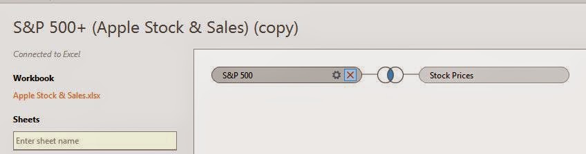
On the data connection page, drag sheets S&P 500 and Stock Prices onto the data connection window reading Drag sheets here.
Step 3.2
Click the Venn diagram icon that appears. In the Join pop-up menu, select the field drop-down list and change the selected value from Volume (Stock Prices) to Date (Stock Prices).

Step 3.3
Close out of the Join menu and click Go to Worksheet.
Step 4
Close out of the Join menu and click Go to Worksheet.
Build the first view
Now that you have your data source set up, begin building the view.
Step 1.1
In the Measures pane, right-click Close, select Rename..., rename the measure to S&P 500 Stock Price
Step 1.2
In the Measures pane, right-click Stock Price, select Rename..., rename the measure to AAPL Stock Price
Step 2
From the Measures pane, drag S&P 500 Stock Price to the Rows shelf.Step 3
From the Measures pane, drag AAPL Stock Price to the Rows shelf.
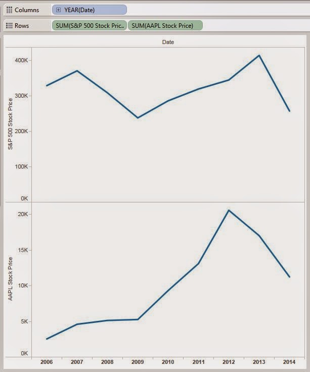
From the Dimensions pane, drag Date (S&P 500) to the Columns shelf.
The view looks like this.
Step 5
Right-Click the Y-axis labeled S&P 500 Stock Price on the bottom graph, select Dual Axis.

Step 6
Right-click the Y-axis on AAPL Stock Price side of the dual-axis graph, and select select Synchronize Axis.

Step 7.1
To better compare the stock price changes between Apple and the S&P 500, it make more sense to reflect the changes in terms of percentage changes of each stock, respectively, beginning from their start dates in the data.
To do this, Right-click the S&P 500 Stock Price calculation in the Rows shelf, select Quick Table Calculation > Percent Difference.

Step 7.2
Right-click the S&P 500 Stock Price calculation again in the Rows shelf, select Quick Table Calculation > Relative to > First.

To do this, Right-click the S&P 500 Stock Price calculation in the Rows shelf, select Quick Table Calculation > Percent Difference.
Step 7.2
Right-click the S&P 500 Stock Price calculation again in the Rows shelf, select Quick Table Calculation > Relative to > First.
Step 7.3
Repeat steps 7.1-7.2 for the AAPL Stock Price calculation in the Rows shelf.
The view looks like this.

Step 8
To get a better look at the fluctuations in stock prices by day, right-click the Date dimension in the Columns shelf, select Day May 8, 2011.

Step 9
Right-click a blank area in the view, select Trend Lines > Show Trend Lines > % Difference in SUM(S&P 500 Stock Price) from the First along Table (Across).
Repeat this process to create the trend line for the AAPL Stock Price.

Step 10
Right-click a blank area in the view, select Annotate > Area...
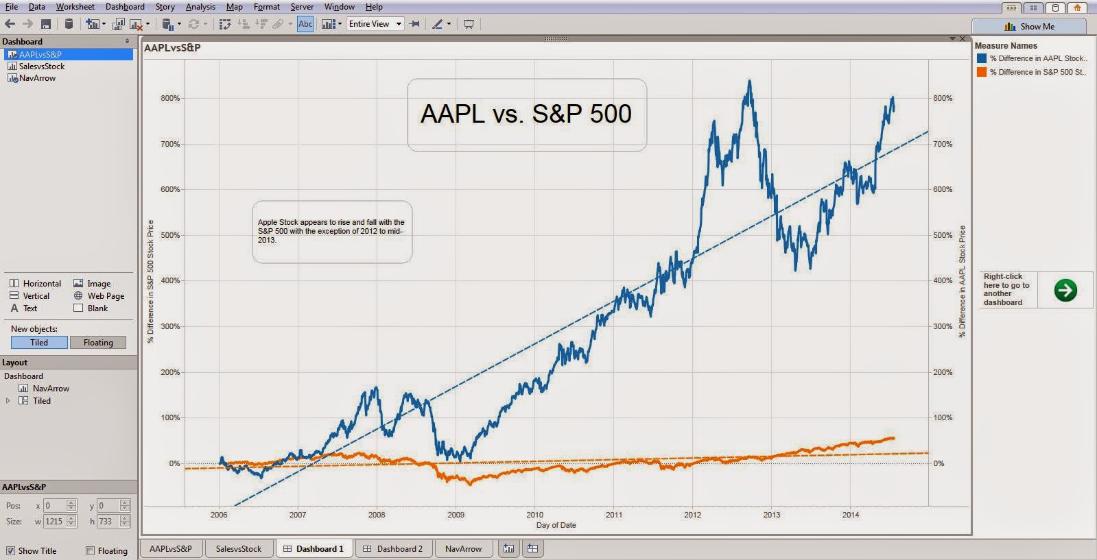
Give the view a title, e.g. AAPL vs. S&P 500. Size and format font appropriately.
Click OK.

Step 11
Right-click a blank area in the view, select Annotate > Area...
Add some textual analysis of what you see on the graph. e.g. "Apple stock appears to rise and fall with the S&P 500 with the exception of 2012 to mid-2013."
Step 12
Right-click the sheet tab labeled Sheet 1 and rename it to "AAPLvsS&P."

The view looks like this.

Build the second view
Begin building the second view in a new sheet.
Step 1
On the current worksheet, right-click the sheet tab, select New Worksheet.
Step 2
Click the Data menu, select S&P 500+ (Apple Stock & Sales) > Duplicate

Step 3
Right-click the copied data source, select Edit Data Source...

Step 4
Remove both of the existing sheets in the connection by clicking the red X's that appear upon hovering over them in the data connection window.
Step 5
Drag the Stock Prices sheet onto the data connection window.
Drag the Sales Revenue sheet onto the data connection window.
Step 6
Alter the join onto Stock Prices to be a left join instead of an inner join by clicking on the conjoining Venn diagram and select Left on the Join menu.

Step 7
Click Go to Worksheet.
Step 8
From the Measures pane, drag Stock Price to the Rows shelf.
Step 9
Right-click the SUM calculation of the Stock Price measure in the Rows shelf, select Measure(Sum) > Maximum.

Step 10
From the Measure pane, drag Revenue ($M) to the Rows shelf.
Step 11
From the Dimensions pane, drag Date from the Stock Prices sheet to the Columns shelf.
Step 12
Right-click the Year category in the Columns shelf, select Exact Date.

Step 13.1
Select SUM(Revenue $(M)) in the Marks card.
Step 13.2
Change the view type in the drop-down menu from Automatic to Bar.

Step 14
Right-click the Y-axis (Revenue ($M)) on the bottom view, select Dual Axis.

Step 15
Highlight all stock data before 2011, right-click on a highlighted portion of the data, and select Exclude.

Step 16.1 (Optional)
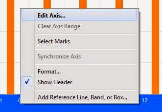
Right-click the X-axis (Date) on the view, select Edit Axis...
Step 16.2 (Optional)
Select the Tick Marks tab.
In the Major tick marks section, select the Fixed radio button.

Step 16.3 (Optional)
For frequency, specify the tick marks to be every 1 Quarters. Click OK.

Step 17.1
To add more white space to the top of the view, right-click the left Y-axis (Max. Stock Price), select Edit Axis...

Step 17.2
Select the Fixed radio button.
Enter 120 into the End textbox.
Click OK.

Step 17.3
Right-click the right Y-axis (Revenue ($M)), select Edit Axis...
Step 17.4
Select the Fixed radio button.
Enter 75000 into the End textbox.
Click OK.
Select the Fixed radio button.
Enter 75000 into the End textbox.
Click OK.
Step 18
Right-click a blank area in the view, select Annotate > Area...
Give the view a title, e.g. Sales Revenue vs. Stock Price. Size and format font appropriately.
Click OK.
Step 19
Right-click a blank area in the view, select Annotate > Area...
Add some textual analysis of what you see on the graph. e.g. "This graph of quarterly Apple sales revenue vs. stock price does not seem to be highly correlated, especially not when observing the peaks during Q3 of 2012 and Q2 of 2013. Perhaps there are additional factors to consider."
Step 20
Right-click the current sheet tab labeled Sheet 2 and rename it to "SalesvsStock"
The view looks like this.

Build Dashboards of the Views
Begin building the dashboards.
Step 1
On the current worksheet, right-click the sheet tab, select New Dashboard.
Step 2
In the new dashboard, click and drag the AAPLvsS&P worksheet to the view.
The dashboard should look like this.

Step 3
On the current dashboard, right-click the tab at the bottom and select New Dashboard.
Step 4
In the new dashboard, click and drag the SalesvsStock worksheet to the view.
The dashboard should look like this.

Step 5
On the current dashboard, right-click the tab at the bottom and select New Worksheet.
Step 6.1
On the current worksheet, from the Analysis menu, select Create Calculated Field...

Step 6.2
In the Name field, enter "Navigation"For the Formula, enter "Right-click here to go to another dashboard"
Step 7
Double-click the new calculated field Navigation from the Dimensions pane to add it to the Rows shelf.
Step 8.1
Double-click the new calculated field Navigation from the Dimensions pane to add it to the Rows shelf.
Step 8.1
In the Marks drop-down list, select Shape.
Step 8.2
Step 8.2
Click on the Shape card and select More Shapes...

Step 8.3
Step 8.3
For the Shape Palette drop-down list, select Arrows.
Select a right-ward pointing arrow.
Click OK.

Step 9 (Optional)
Select a right-ward pointing arrow.
Click OK.
Step 9 (Optional)
Modify the size of the arrow in the view by clicking the Size card and adjusting.
Step 10
Step 10
Right-click the Navigation field label on the view and select Hide Field Labels for Rows.

The view should look like this.

Step 11
Rename the sheet to be "NavArrow".
Step 12
The view should look like this.
Step 11
Step 12
Return to Dashboard 1 by clicking the Dashboard 1 tab at the bottom of the window.
Step 13
Step 13
Click the Dashboard menu at the top of the window, select Actions...

Step 14
Step 14
Click the Dashboard menu, select Actions...
Step 15
Step 15
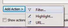
From the Actions menu, select Add Action > Filter...
Step 16
Step 16
In the Name textbox, enter "Go to SalesvsStock Dashboard."
In the Source Sheets drop-down list, select Dashboard 1. Check the box next to the NavArrow sheet, uncheck the box next to the AAPLvsS&P sheet.
In the Target Sheets drop-down list, select Dashboard 2 and check the box next to the SalesvsStock worksheet.
Under Target Filters, select Selected Fields with no fields selected.
Leave all other settings the same. Click OK twice to return to the dashboard view.

Step 17
In the Source Sheets drop-down list, select Dashboard 1. Check the box next to the NavArrow sheet, uncheck the box next to the AAPLvsS&P sheet.
In the Target Sheets drop-down list, select Dashboard 2 and check the box next to the SalesvsStock worksheet.
Under Target Filters, select Selected Fields with no fields selected.
Leave all other settings the same. Click OK twice to return to the dashboard view.
Step 17
Drag the NavArrow sheet onto the dashboard view.
Step 18
Step 19
Step 18
Click the down arrow at the top of the NavArrow view in the dashboard, select Floating. Position and re-size appropriately.

Step 19
Right-click the Title of the NavArrow view and select Hide Title.

The view looks like this.
Step 20 (Optional)
The view looks like this.
Step 20 (Optional)
You can now quickly navigate to the SalesvsStock dashboard by right-clicking the arrow on the dashboard and selecting Go to SalesvsStock Dashboard, just as easily as you would when using the Story Points feature in Tableau 8.2.

Dataset link above does not provide Apple data but Seattle Home Sales.
ReplyDeleteYes. pls post the correct file
ReplyDeleteYes. pls post the correct file
ReplyDeleteCan you please post the correct data file.
ReplyDeleteThanks
This comment has been removed by the author.
ReplyDelete